1
2
3
4

Branding • e-publishing
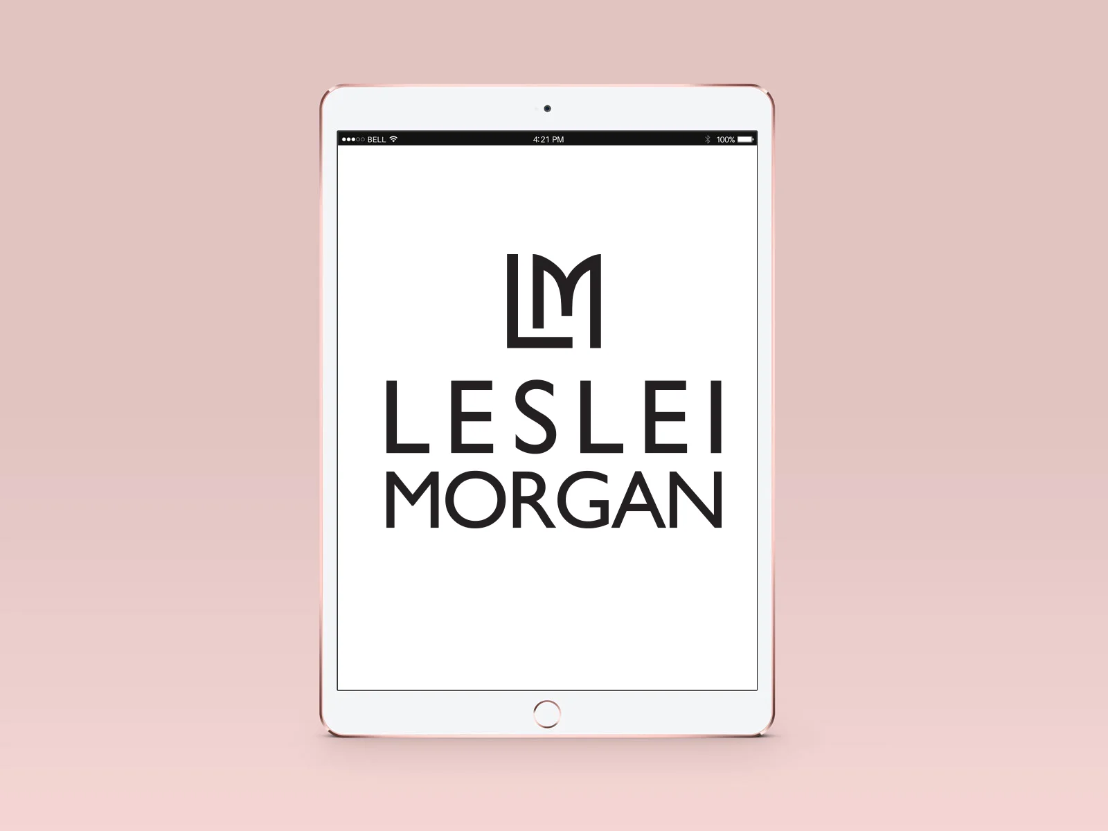
Logo Design for a London-UK e-publishing company.
The LM symbol was created to resemble a book on a shelf.
Branding + Corporate Identity
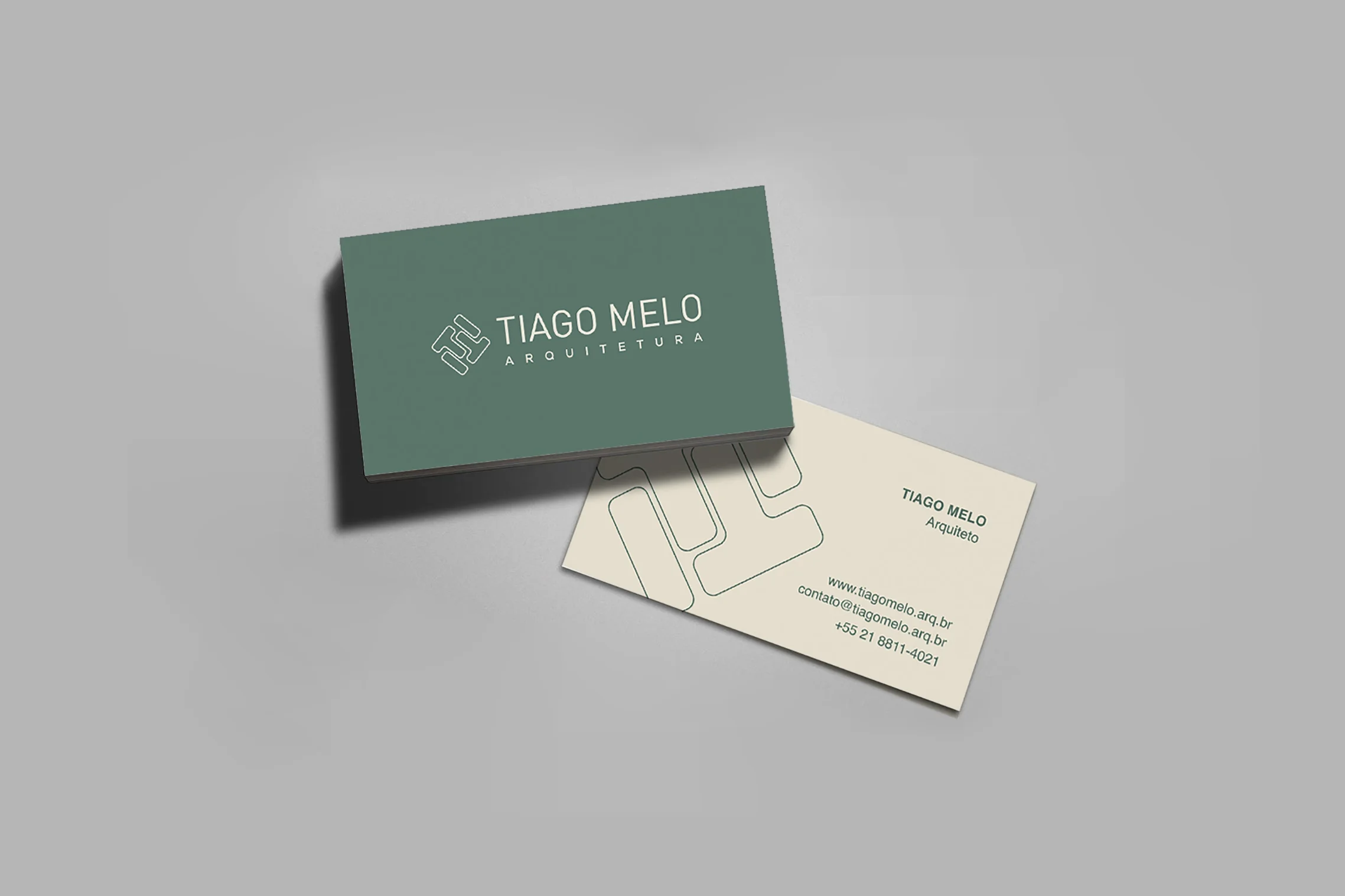
Tiago Melo Architecture [ Rio de Janeiro, Brasil ]
The logo was created to resemble architectural structures and the colors are related to the sustainable approach of the architect towards his projects.
Geopack Branding
Geopack is a Packaging Design Solutions company who requested a new brand identity
Brand Identity
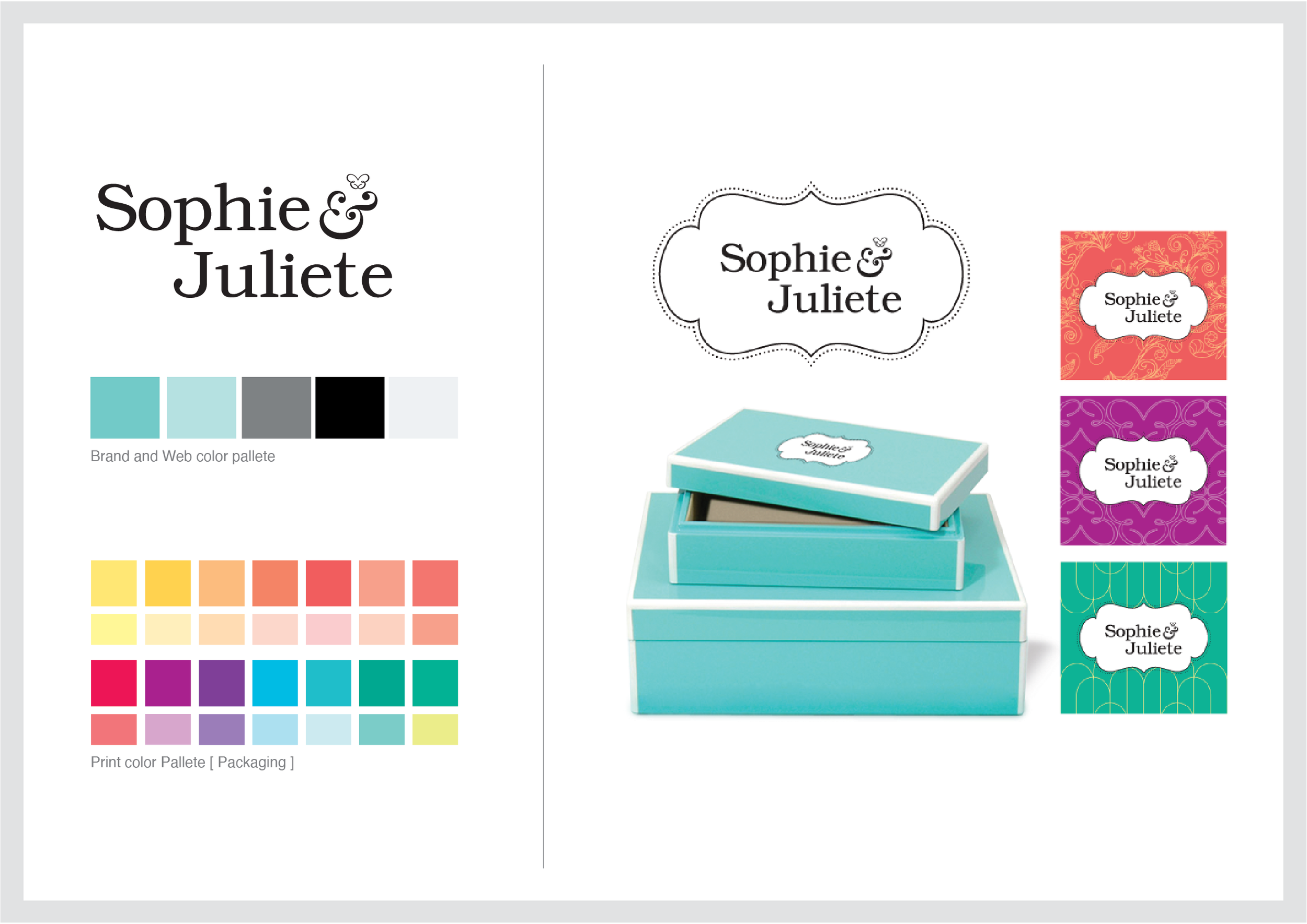
Sophie & Juliete was a brand created for an e-commerce platform that sells jewelry online.
Besides thinking on how the logo and color pallet would be used on their digital platform, I also created their identity for their packaging as well.
Digital products and Institutional materials would mainly use the teal tones, grey and B&W allied to the logo. And the Packaging could also use the other colors allied to the more complex version of the logo with a frame around it. Also, a set of different prints were made for the packing line as well.